

Ransom Note
Bringing coherence and a fresh perspective to an established music media platform through a communication strategy, brand development and branded assets for online promotion.
Laying bare the mechanics of corporate advertising for Graphic Design Festival Scotland

Each year, Warriors lead the creative direction and design for Graphic Design Festival Scotland – an international symposium which has welcomed attendance and participation from nearly a quarter of a million creatives since 2014.
The work includes; the festival's communication strategy, refreshed brand identity, website, social media, campaigns and the design of any books published.
The 2019 brand identity and campaigns led to split opinions, some confusion, the strongest engagement in six years and a sold-out programme with more than three thousand attending.
For the branding and campaign, we exposed the simple, manipulative mechanics of corporate advertising and utilised them critically and unashamedly.
Do you love sunsets, sandy beaches, cold ice cream, cute puppies, smiling faces and romantic sunsets? Don't we all. Feel good. Buy tickets.


– Inspire and engage the design community
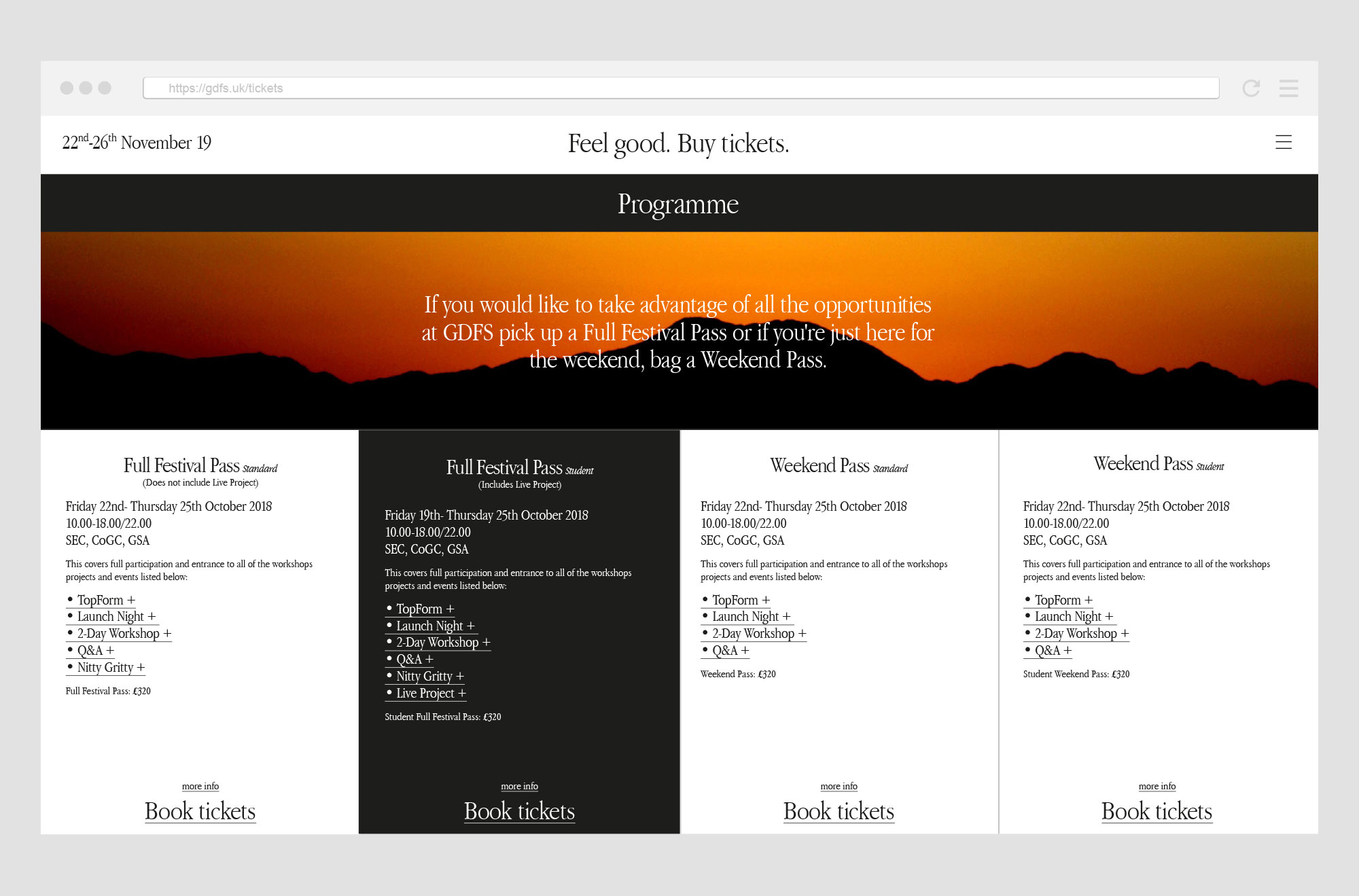
– Promote the festival programme and each event within it
– Promote all of the designers leading workshops and speaking at events
– Sell tickets to the events
– Maintain the festival’s focus on bringing an international community together
– Promote the graphic design and visual communication
– Celebrate graphic design and visual communication
The festival's strategic aims in 2019 were to grow into something leaner stronger by removing anything unnecessary or inefficient in the programme. This led us to discussions around utilitarianism.
Discovering that utilitarian means useful or practical as opposed to attractive, while “maximum utility” means producing the most happiness for the greatest number of people. This apparent contradiction sparked debate around whether utilitarianism is a paradox based on the link between beauty and function. After reviewing Dieter Rams' "principles of good design" we asked:
What is the most pure function of the identity for Graphic Design Festival Scotland?
We would like people to feel good when they see the identity and then we would like them to book tickets to attend the events. Feel good. Buy tickets. Pure and simple.


We're surrounded by brands and retailers overwhelming us with perfectly captured filtered product photography. The food looks tastier than we could ever cook, the fresh-faced models are sun-kissed and stress-free, the clothing is perfectly tailored, the destinations include a calming turquoise ocean and the general consensus is 'buy our product, service or experience and you will be happier'.
Perfect photography is combined with catchy emotive slogans such as, ‘Quality worth every penny', 'Because you're worth it', 'Impossible is nothing', 'The happiest place on earth' and so on. These marketing strategies offer the idea that your life will be instantly better by having an Aston Martin, you deserve to spend extra to use L’Oreal shampoo, you can achieve your wildest dreams by wearing Adidas trainers, your children won't be happy if you don't spend thousands of pounds going to Disneyland and you may as well spend the extra on branded foods. These brands spend millions of pounds a year on this exact strategy and it seems to work. When written plainly, the ideas and strategies are ludicrous and shallow, however, it's difficult for us not to be subconsciously influenced and controlled by strategic marketing and branding.


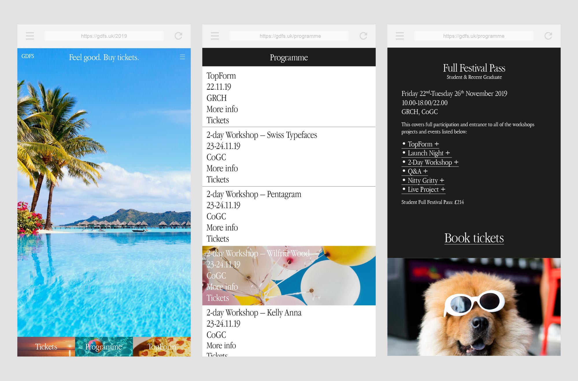


The visual language is inspired by 1950s-80s corporate advertising which combines emotive copy-driven slogans with photography highlighting how much better your life would be with buying a specific product or service. To connect this directly with the design world, the typography and treatment is specifically inspired by Apple, who despite being heralded as ground-breaking and pioneering use exactly the same tropes as other large corporations.
The photography used is specifically selected for it’s hyper-real aesthetic, like the imagery used in advertising. Clean, shiny and perfect. The imagery portrays a life and level of perfection which is unattainable and disconnected from reality. It hijacks our insecurities and feeds the greed and desire inside of us for something better.
The black and white colour palette for text-based graphics and information complements the saturated photography.
The website interactions reveal "hits" of positivity behind blocks of information and feel-good imagery peppers the site at various points with the listed programme format echoing the utilitarian origins of the concept.


Unlike the corporate advertising we’re familiar with, we reveal the objectives and our intentions with the identity in the tagline: “Feel good. Buy tickets.”. Unexpected sincerity hopefully encourages more questioning around the authenticity and motives behind advertising and helps highlight the falsity and manipulation.
For the tone of voice and messaging throughout the social media campaigns, we familiar structures and mechanisms to provoke emotional responses; hope, desire, fear and inadequacy. Some of the messaging feels genuine and sincere: “Making it in the design industry is hard. Make it easier for yourself. Attend GDFS.” while others are more tongue in cheek, criticising the impossibility of the slogans we’re regularly exposed to: “Improve your wellbeing. Buy tickets.” and “If there’s one thing you do this year… book your tickets to Graphic Design Festival Scotland.”


A sold-out programme with more than three thousand attending and strong engagement across social media.
The identity caused a stir; divided opinions, surprised, caused a little confusion and gathered strong support from those who scratched beneath the surface.
This work was published by the American Institute of Graphic Arts.